All About User Interface
March 17, 2017
We “launched” Supply Clinic website in the summer of 2015, allowing anyone to purchase through the site late in June. It was, in many ways, a soft launch- we left a tag with the word “Beta” under our logo, and didn’t have much fanfare surrounding the switch. But we almost immediately thereafter packed our bags for San Francisco, and exhibited at the California Dental Association’s annual conference.
Our product was panned. Hard.
Everyone loved the concept- an online marketplace for dental supplies, bringing together dozens of sellers and allowing them to compete in a free market, without the cost of premiums or the hassle of sales reps.
But hardly anyone even got past the homepage. They didn’t even have the opportunity to discover that we only had a few thousand products live on the site. They didn’t get far enough to realize we didn’t have many, if any, products that were actually sold by multiple vendors. They didn’t realize much at all except that they weren’t interested.
I think the site’s user interface might have had a thing or two to do with that.


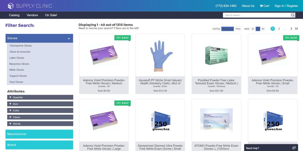
What’s remarkable isn’t how different our various site pages look, but how similar they were in function to how they operate today. True, our homepage is cleaned up a bit, and doesn’t have the filters they used to. But those filters are still on the left-hand side of search pages, and those search pages have the same basic grid format.
But the UI is, of course, very different. And as much as I didn’t want to invest time or resources into cosmetic changes, it’s become patently clear to us that appearances matter. Looking back, I’m shocked that anyone would use a live credit card on a site that looked like ours used to.
We’ve cleaned up our act a bit since then:

We couldn’t have gotten the site’s appearance to where it is today without the help of others. The good folks over at Designation.io created a number of different options of new appearances for the site. They provided a number of different visual elements, ranging from page mockups to full color templates.
We also would never have been able to do it without our lead developer, Dan, who somehow manages to do it all without breaking a sweat. (He’s not even a UI guy!)

This is Dan
Our site’s UI will always be a work in progress, as we try to make it as comfortable and familiar as possible. Do you have any thoughts on what we can do to further improve the user interface of our site? Write in to us at [email protected]! We’re always looking to improve, and we know we’re just getting started.
Ready to save with Supply Clinic?
Start Shopping!